
What Is Responsive Design?
Responsive Design is an approach to creating content that allows for an optimal user experience across a wide variety of devices, including phones, tablets, and desktop devices. The content should be usable across these devices with a minimum of zooming or panning, allowing the user to get the best content experience available on each device.
There are many Responsive Design solutions currently on the market, from JavaScript libraries for programmers, to end user authoring products. Each of these operates on the same core principle, the content is laid out on a fluid grid which responds to the width of the device that the content is viewed on. As the view area gets smaller, the grid collapses, and content is repositioned to allow for viewing without the need to scroll the content horizontally or zoom. Most end user focused tools use device width-based “breakpoints” at which a new layout will be used to format the content.
Issues with Current Responsive Design Solutions
It seems that every new device that comes on the market has a new screen resolution or physical size. With that comes corresponding changes in the CSS pixel count, which is the logical size of the device that Web pages are rendered into. Because of this varying pixel count, it becomes quite complex to know exactly how your content will be rendered on any particular device. You would need to test your content on every device that your users may have in order to definitively know how your content would lay out on each device. In a BYOD world, this just isn’t practical or even possible.
If you use a width-based breakpoint to define content for a tablet, what happens when the newest phone has a logical screen width that is the same as the tablet? The view you intended for a tablet is used on a phone, even if the screen on that phone is too small to render it properly. As technology progresses, this problem will occur more often.
eLearning content also is quite a bit more dependent on the relative position of objects. If you have a character pointing out which bolt to turn on the new widget that your course is describing, it doesn’t help to have those objects be repositioned when the content is viewed on a phone, or when the phone is rotated between landscape and portrait modes.
What we really want to know is what the course will look like on a phone, a tablet, and on a desktop, and we need to consider landscape and portrait modes for the phone and tablet.
The Solution: Responsive Course Design in Lectora
The solution is to design for device type and orientation, instead of screen width. This gives us 5 possible views to design for:
You only need to design once, in the desktop view. Content will be automatically sized and positioned on other views. Each view can then be tailored as necessary to accommodate the unique needs of that view, and changes in each view will be propagated using the inheritance model shown in the figure below:

Changes at the desktop level will be propagated down to all of the other views. Changes made at the tablet level will not affect the desktop view, but will be propagated to the phone views. Changes at the phone views will only affect the respective phone views.
Mobile views (tablet and phone) will scale the content to fit the exact width of the screen, with vertical scrolling if the content is taller than the screen height. This allows you to have designs in which you will always know exactly how the content will be rendered on each device. Content laid out for the phone will look the same on every phone, regardless of the resolution of the screen on that phone.
Lets take a look at how a sample course would be laid out on several devices.
On a laptop, which would correspond to the desktop view, you have lots of room to work with, so you could have many options for the user that could include things such as rollovers which only make sense in the context of a laptop/desktop experience.


When viewing the same course on a phone, your display area is greatly reduced, so you need to consider the content that is added. For a landscape view, the viewable area is wide but not tall. In this case, removing some of the extra navigation buttons and reducing the image sizes still allows for a good course experience, giving the user all of the information he or she needs.
A phone in portrait view is generally the most challenging device view to design for. In this case we have elongated the text block, and wrapped it around the images, while also overlapping the two images a bit more. Again, this gives us all of the information, in a format that is easily usable on the phone’s viewing area.

Lectora manages this through a unique methodology we call Responsive Course Design. The Lectora interface has been enhanced with a Responsive Bar at the top of the work area. This allows you to switch between device views within the title.
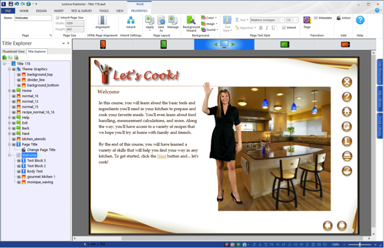
Working within the main view, you build your content just like you always have with Lectora. You can then switch to other views to see how your content is laid out. If anything needs adjusting between views, it’s as simple as moving and sizing as necessary. For example, to remove the buttons from the landscape phone view as shown in the images above, just drag the buttons off the view:

With Lectora's Responsive Course Design, each view can have its own layout, and a single publish will produce best-in-class HTML output optimized for viewing on all devices and orientations.
The Final Word
It’s a multi-device world we live in, and Trivantis is bringing you the tools you need to produce eLearning content for all of them. With Lectora, you can truly publish once, and distribute everywhere.
.svg)
